

Tuesday, 24 December 2013
Monday, 23 December 2013

Sunday, 22 December 2013

Saturday, 21 December 2013
Shot List
Wide angle shot of girl sitting in bath
tub.
Jump cut zooming, whereby image zooms on
figure within bath tub= uneasy approach suggesting something bad could happen.
Water is turned off, but tap is dripping
in steadily.
Close up of dripping water.
Change to close up of girls face (tears
running down her face).
Cut to medium shot of girls trembling
body.
Slow panning down to her arms (blade in
left hand over right wrist)= panning shot reveals scars along her arm= previous
suicide attempts.
Change of location to kitchen= boy reading
suicide note (ringing sound similar to when an explosion has gone off to
disorientate audience)
Close up of note.
Sound of boy screaming.
Boy drops letter (medium shot) letter
falls to floor(focus on letter), showing blur of boy running in the background
to try and save the sister.
Match on action of boy running up stairs
(High angle shot)
Over the shoulder shot of boy banging on
door.
Silhouette of boy appearing through
translucent glass door.
Implication of girl slitting wrist= under
water shot showing drop of blood falling in water from arm above.
Arm falls in water.
High angle shot of blood dispersing
through the water.
Close up of mother opening door with a
screw driver.
Boy pulls sister out of the water and
cradles her screaming for help(wide angle shot).
Sister is fading away (close up of eyes
slowly closing).
Close up of drops from tap falling. Drops
become fewer and further apart.
Drops stop= signifying the girl has died.
Monday, 11 November 2013


Sunday, 10 November 2013

Saturday, 9 November 2013
Audience Profiling
1) Who are they? (Girls/Boys)
-my film will target people of both genders. The nature of the plot is an occurence in both genders. As a result, it must address people of both genders.

2) Age Range.
-Given the dark themes that occur within my film, the age range will be for people of 15 years and above. Not only will this mean that the consumer will be able to understand the complex themes of the film, they will also not be emotionally disturbed by it. At least less disturbed then people of a younger bracket.

3) What are their interests, hobbies and fashions?
The target audience will be interested in finding out how to overcome their problems, or perhaps to understand what occurs with people who suffer from this horrible addiction. Due to the wide demographic of viewers, their hobbies could include just about anything. Especially seeing as the gender is different. The fashion that I would expect the consumer to be into is potentially more gothic. The reason for this is that self harming as a common theme of people of a gothic belief or nature.

4) Where would they see your product advertised?
I would expect my product to be advertised in suicide information websites and magazines, as it would help to illustrate to people who are thinking of self harming or killing themselves that other people are going through them and there are ways to overcome their problem.
5) What magazine would they read?
I would expect the potential audience for my film to read many different magazine types, given that they come from such a broad group of people. The magazines could go from tabloid magazines, to comic books, all the way to newspapers and sports magazines. As a result, confining this audience into one narrow and specific magazine type is extremely difficult.

6) Where do they live and what ethnic group does it appeal to?
similarly to the magazine, question, self harmers, and sympathisers of self harm come from and live in all sorts of places, globally. As a result, this is difficult to assess. This being said, the self harmer section of the viewer could potentially come from a broken home, or an area whereby there are regional difficulties, leading them to do what they have done. With regards to ethnicity, people of all ethnicities self harm. The film however could be seen to appeal more to a white audience. The reason for this is that all of the actors that are in the piece are white, and is showing the struggle of a white individual as opposed to people of other groups.

7) Can you define the generation of your target audience?
If I were to have to define the generation of my target audience, I would have to say that whilst the majority of the viewers will be of the older generation, who have not been exposed to such vast developments of media, the youngest members are part of the new generation of media. This new generation have been able to see the old media, from pre-web, to Web 1.0 up until Web 2.0. The wide range of viewers makes the audience a very interesting group to try and understand.
Wednesday, 6 November 2013
Final Logo Design Choice
I decided to use this image as my final choice for my film company logo. The image shows an edited image of Surfer's Paradise in Australia. This is a significant place to me given my Australian connections, and was the place where I found my love for film. Moreover, it was the location of my AS film 'Roll With It', so I felt it fitting to use this silhouette as my final film company logo. The dark colouring of the image contrasted with the reflection of the moon on the waters surface is a great aspect of this piece, as it brings lightness to a space filled with darkness, in a similar way that film brings happiness, or an array of different emotions to people.

Monday, 4 November 2013
Film Company Logo Design Options
For this part of the coursework stage, I had been looking at my film company logo, and was somewhat underwhelmed by the final product that came out in the shape of the shield with the silhouetted objects.
As a result, I decided to use pictures of major city scapes across the world. The idea came after a visit to 'glassworks studios', whereby I ascertained that huge amounts of the media production industry is located in major cities within very close proximity to each other.
I was also fascinated by the expansive creative architecture, which links with media in the sense that the planning and the work is just as important as the final product.
Using adobe illustrator, I was able to isolate the colouring system making the image in purely black and white. Furthermore, I used the dual coloured title to emphasise the two different types of media coming together to form a creation.

This image is of the petronas towers in Malaysia. These are the largest dual tower system in the world, and are connected by a walkway that connects the building. Perhaps the most fascinating part about these buildings is that the walkway is a moving beam, as the wind is so strong at that height that the buildings slightly sway, which would make the beam extremely dangerous.

This image is of Hong Kong's city from the water front. The water's reflections of the buildings helped to add character an energy to the piece which I found extremely interesting.

This image was taken in time square at rush hour during the day. The black an white within the image almost further excentuates the energy and motion that is present in this scene, as you have to look in greater detail, and with such an action, you are able to spot much finer details that would otherwise have remained un-noticed if in color.

This image above has personal meaning to me as is set on the Gold Coast in Australia, which is where my family are from. The image is taken out on the broad water, and the brilliance of this image is that the reflections of the lights coming off of the building and the moon are reflected by the surface of the water. This adds energy and depth to the image.

This image is of Shanghai's city scape. What was so interesting about this image was the fact that this is perhaps the most crowded out of all of the city's I looked at, and yet, it is one of the most productively efficient, and new business and media opportunities open up every day.
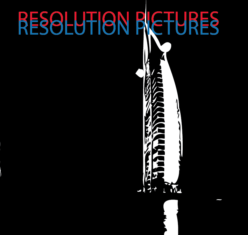
This image of a lone sky scraper in Dubai, symbolised in my eyes the potential opportunites and wealth that exists in this nation. It also shows the revolution from the empoverished people which they once were, before oil capabilities, to the now whereby they are building up their infrastructure along with some of the most incredible buildings in the world.

This image is located above Cristo Redentor in Rio De Janeiro. Whilst this does not directly show city scapes or buildings as such, I was fascinated at the production of this statue. It towers well above the rest of the city, and is next to the favelas of Rio de Janeiro. What is so interesting about this statue is that it comes in a city that has such contrasts between the wealth of its inhabitants, but Christianity is the one thing that the public have in common with one another, and can bring the strangest groupings of people together.

This image is based in the docks of Boston. This image is different as whilst I used the same effects on illustrator to colour the image, I had to spread the image over two different sections due to the width of it. The width came as a result of the camera being used being a panoramic. Despite the increased difficulty of editing this, I was adamant in using it, as it seemed the most structurally ordered layout of all of the city scapes I viewed.

As one of the most recognisable city scapes in all of the world, using Paris was essential. Paris is seen by many as the creative and artistic hub of the world, and with reference to media, this city fits perfectly.
Sunday, 3 November 2013
Gif Showing Creation Of Film Company Logo

Initial Attempt at Film Company Logo


I used DTPP photoshop to design a film company logo, with which I could create a brand image that would represent my films. The knight chess piece and the shield both signify the stability and strength of both the company and the work, and the silhouette of the cameraman takes on a more literal representation of it being an actual film company.
Friday, 18 October 2013
Mood Board For Short Film

Above is a mood board, showing some of the moments that occur in my film that entice the greets amount of emotion from the viewer. Furthermore, all of the pictures are shown in vibrant or bold colors, so as to stand out from the darkness.
Wednesday, 9 October 2013
St. Johns Ambulance Promotional Video

This shot was essential to the whole piece as it was the establishing shot whereby the entire scene was set and the man finds out the news that he has cancer. The mans reaction is what I find most fascinating within this film, as it shows the reaction of shock in the beginning, but we soon learn that this will change as he finds out the impacts and implications of this problem.

This shot was very interesting, as it is taken just after the man has found out that he has cancer. He is still displaying signs of shock from the news, however his tilted head suggests that he is now processing the information and is beginning to understand the challenge ahead of him. This shot was very important in how I would show my character when she finds out her boyfriend has cheated on her. The reason being that both characters are devastated at the news, but are in the similar phase of contemplation.

Within this frame, the man is telling his wife the news that he has cancer. This moment is perhaps the most interesting of all, and bears the greets amount of emotion. Within this shot, we gather for the first time that there are other parties involved in his struggle and that the news will not only impact on him, but will also greatly impact the lives of his family.

This shot is take from the same sequence whereby the man is giving the news to his wife. The man for the first time demonstrates his true feelings about what is happening, and perhaps having a loved one to share it with has enabled him to fully comprehend that he is not alone in this struggle and the love his family have for him will help him through the difficult times.

The mood soon changes once again within the piece, when the man is having his head shaved by his wife to hide the hair loss from chemotherapy. when his head is shaving, they both share a laugh with one another, which signifies their bond and that even though cancer is a horrible thing, people can still go on with their lives irrespective.

Despite the momentary change in mood of this piece, it quickly changes once again back to the realization of the condition by the audience. The shot shows the man in a hospital undergoing chemotherapy. The lettering above the patient almost alienates them and makes them seem to be lesser, which I found very interesting. This realization occurs within my piece when the girl is sitting in the bath tub, and is holding the blade to her arm. At this moment, the audience are able for the first time in the piece to ascertain what the girl is about to do and the effect that the news she has found has had on her.

This shot is imperative to the piece, as it signals the beginning of the mans recover, after he has undergone surgery. The man is clearly still in a bad state after the stress he has undergone, however, he is improving physically and can now walk freely.

This shot above and the one below are both shots that accompany the shot showing the man on the treadmill. They show the man doing normal things that he was unable to do whilst he still had cancer, however through the surgery and the rehabilitation he is able to regain normality in his life.


This moment shows a change once again within the narrative, which is perhaps the most shocking moment within the whole film. The man is eating a burger when suddenly he swallows a chunk too big for his throat and is suffocating. This change once again in the plot is completely unexpected and ironic in the sense that it was the food that killed him as opposed to the cancer. This twist can be seen within my piece, when the girl is revived using a defribulator, and is perhaps the most shocking moment in the entire piece.

This is the realization shot in the piece, whereby the audience now understand that the man has indeed died through suffocation. It is an extremely somber and disheartening moment for the viewer, as they have witnessed the struggle this man has gone through to recover, and has been killed by something so inadequate, that could have been prevented had the people around him known what to do in the given situation.
Tuesday, 8 October 2013
Analysis Of Music Video (Coldplay: 'Strawberry Swing')
Here is an analysis of Coldplay's music video 'Strawberry Swing'. A four minute and 15 second music video. The video was Directed by a group of visual artists from London under the anagram of Shynola. The video expresses the film in an alternative and highly effective way.

Camerawork


Sound
The Music Video is set to Cold Play's song 'Strawberry Swing'. Whilst there are parts of the music video whereby it is difficult to see links between the narrative and the lyrics of the song, there appears to be some form of continuity in other areas. For example, when the lyrics go "Cold Cold Water", the main character falls into a body of water.

The light hearted nature of the track is brilliantly accompanied by shots throughout the entirety of the film. The character being portrayed as a superhero, who has to fight against giant fishes and squirrels fits in well with the soundtrack.

Editing
Given that the film is made through the use of stop motion animation, the editing process of each individual shot is absolutely crucial to an effective media text. The editing in this piece is seemless, and almost looks to have been created in one fluent motion. The small movements of the body that are accentuated by the use of photos instead of film adds character to the film and makes it all the more entertaining.
Mise-en-Scene
The use of wardrobe is essential to this pieces success. With limited scope as to what the character could do lying down on a chalk board, the constant change of outfits helps to keep the audience interested throughout the piece. The quick transitions of clothing changes makes the character seem like a superhero.
The use of lighting within this piece is crucial to assembling the visual effects of the film. The reason for this is that whilst the camera may be in a fixed position in an overhead shot, the placement of the camera to create the shadow creates an almost three dimensional effect to the clip.

The use of props within this piece are limited to clothing items. The simplicity of the setting and props do not hinder this piece however, as it allows the actions within the piece and the art work in the background show effect rather then objects that boost budget costs.


Monday, 7 October 2013
Music video analysis of 'The Pharcyde 'Drop' by Spike Jonze
Here is an analysis of The Pharcyde's music video 'drop', a three and a half minute music video. The video was Directed by Spike Jonze, and uses new media techniques to show moving imagery that had initially been untried.

Camerawork
The majority of the shots used in this music video are done via dollying of the camera. These shots are used to show fluidity in the motions and emphasises the movements of the characters in the scene. The large usage of low angle shots also empowers the characters in the film, as it adds the effect that the viewer is looking up at them.

The film is set to fit to The Pharcyde's song 'Drop' and the actions that occur within are loosely linked around the lyrics within the track. The soundtrack is fairly serious in its delivery, which is why the actions within the video suprise me so much. The actions are somewhat goofy, showing the characters to be able to do near impossible movements. This contrast in the two forms of media makes the viewing experience only more interesting. The pace of the song is fairly slow so as a result of the slow motion movements of the characters, they are able to fit perfectly in time to the music. The entirety of the film uses non-diagetic sound, thus accentuating the experience for the viewer to be fairly surreal.
Editing
The clip is edited in a way that it will appear that this journey occurred in one fluid motion. Throughout the entirity of the clip, there are only four transitions. This adds to the effect of the video, as the viewer is able to intake all of the actions and surroundings, improving the video's appearance.
Mise-en-Scene
The use of clothing as props in this video helps to create a surreal narrative to the music video. The characters have three sets of wardrobe throughout the video. The quick transitions and change of clothes make the video seem less realistic and almost dream like.
The lighting within this piece is entirely done through natural sources, however this does not take away from the overall appearance of the piece, as the light is consistent throughout.
Props for the most part are not used within this piece, apart from to accompany the movement of the characters e.g. cars which they jump off. However, the use of the hammer at the end to shatter the sheet of glass creates an interesting climax to the music video.


Subscribe to:
Comments (Atom)