
For this part of the coursework stage, I had been looking at my film company logo, and was somewhat underwhelmed by the final product that came out in the shape of the shield with the silhouetted objects.
As a result, I decided to use pictures of major city scapes across the world. The idea came after a visit to 'glassworks studios', whereby I ascertained that huge amounts of the media production industry is located in major cities within very close proximity to each other.
I was also fascinated by the expansive creative architecture, which links with media in the sense that the planning and the work is just as important as the final product.
Using adobe illustrator, I was able to isolate the colouring system making the image in purely black and white. Furthermore, I used the dual coloured title to emphasise the two different types of media coming together to form a creation.

This image is of the petronas towers in Malaysia. These are the largest dual tower system in the world, and are connected by a walkway that connects the building. Perhaps the most fascinating part about these buildings is that the walkway is a moving beam, as the wind is so strong at that height that the buildings slightly sway, which would make the beam extremely dangerous.

This image is of Hong Kong's city from the water front. The water's reflections of the buildings helped to add character an energy to the piece which I found extremely interesting.

This image was taken in time square at rush hour during the day. The black an white within the image almost further excentuates the energy and motion that is present in this scene, as you have to look in greater detail, and with such an action, you are able to spot much finer details that would otherwise have remained un-noticed if in color.

This image above has personal meaning to me as is set on the Gold Coast in Australia, which is where my family are from. The image is taken out on the broad water, and the brilliance of this image is that the reflections of the lights coming off of the building and the moon are reflected by the surface of the water. This adds energy and depth to the image.

This image is of Shanghai's city scape. What was so interesting about this image was the fact that this is perhaps the most crowded out of all of the city's I looked at, and yet, it is one of the most productively efficient, and new business and media opportunities open up every day.
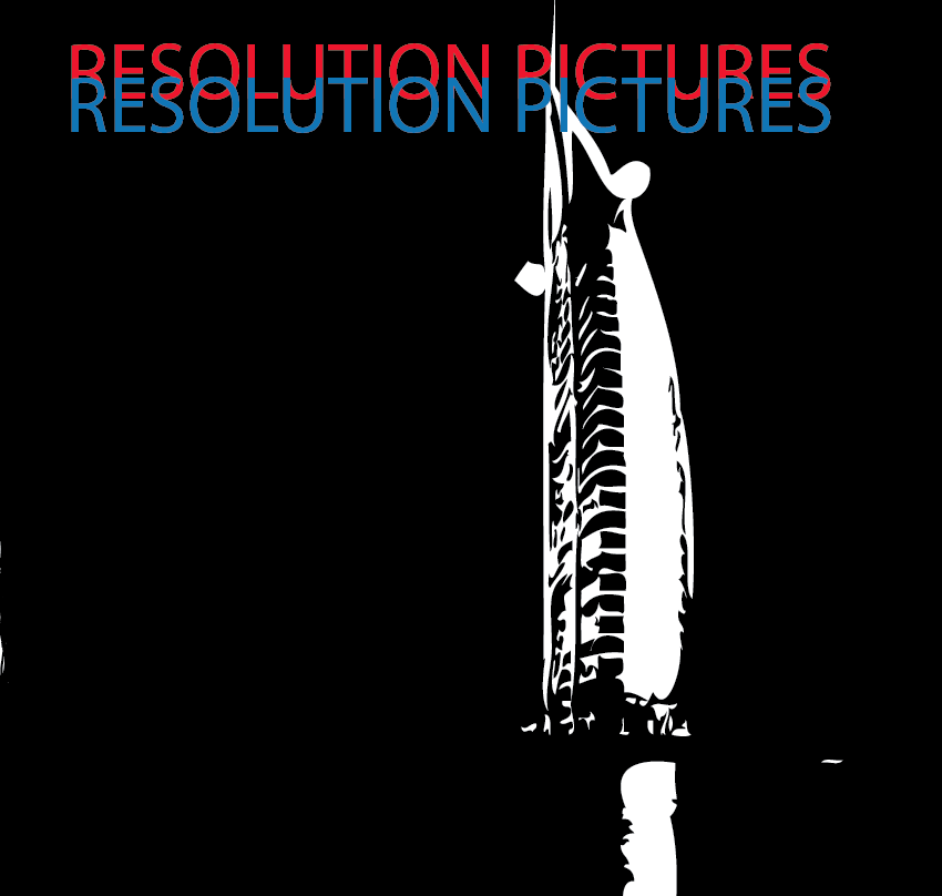
This image of a lone sky scraper in Dubai, symbolised in my eyes the potential opportunites and wealth that exists in this nation. It also shows the revolution from the empoverished people which they once were, before oil capabilities, to the now whereby they are building up their infrastructure along with some of the most incredible buildings in the world.

This image is located above Cristo Redentor in Rio De Janeiro. Whilst this does not directly show city scapes or buildings as such, I was fascinated at the production of this statue. It towers well above the rest of the city, and is next to the favelas of Rio de Janeiro. What is so interesting about this statue is that it comes in a city that has such contrasts between the wealth of its inhabitants, but Christianity is the one thing that the public have in common with one another, and can bring the strangest groupings of people together.

This image is based in the docks of Boston. This image is different as whilst I used the same effects on illustrator to colour the image, I had to spread the image over two different sections due to the width of it. The width came as a result of the camera being used being a panoramic. Despite the increased difficulty of editing this, I was adamant in using it, as it seemed the most structurally ordered layout of all of the city scapes I viewed.

As one of the most recognisable city scapes in all of the world, using Paris was essential. Paris is seen by many as the creative and artistic hub of the world, and with reference to media, this city fits perfectly.
No comments:
Post a Comment